Logo design and ideation for St. Louis Junior Roller Derby. They asked for a design to add to some shirts, and to use for stickers and other merchandise to sell at events. We decided to go with a simple, versatile logo design based on a skate wheel that could be easily scaled and colored depending on the situation.

As the Bombers’ manager, so I had to come up with some uniforms. In an effort to defray the cost, I asked Das Bevo to sponsor, and then designed and produced the hats and shirts. The design was meant to be simple and readable with a nod to the sponsor’s existing brand identity.

Since the standard business card size is almost equal to the size of a door hinge, this card for a carpentry business serves as a simple reference to the hinge, and the turn of a screw.

Identity materials for Castle Lawn Care, including a logo, business cards, and leave behinds. With castle in the name, we decided to reference that with a castles “turrets” in the composition of the logo.
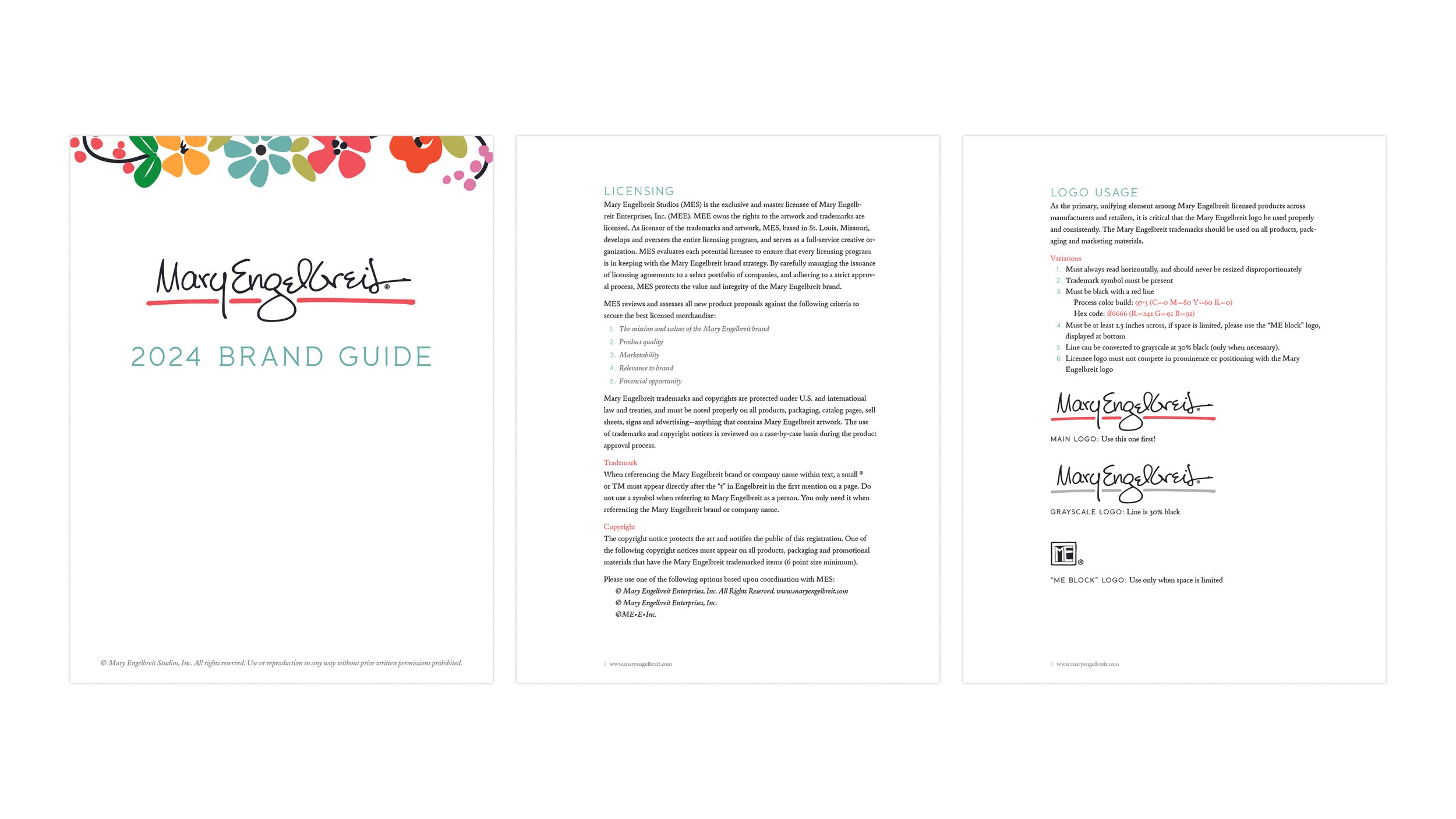
The brand guide for Mary Engelbreit Studios was designed and distributed to the licensees in an effort to maintain consistency across many different companies and products and answer questions regarding assets, packaging, copyrights, and more. See the full guide here.

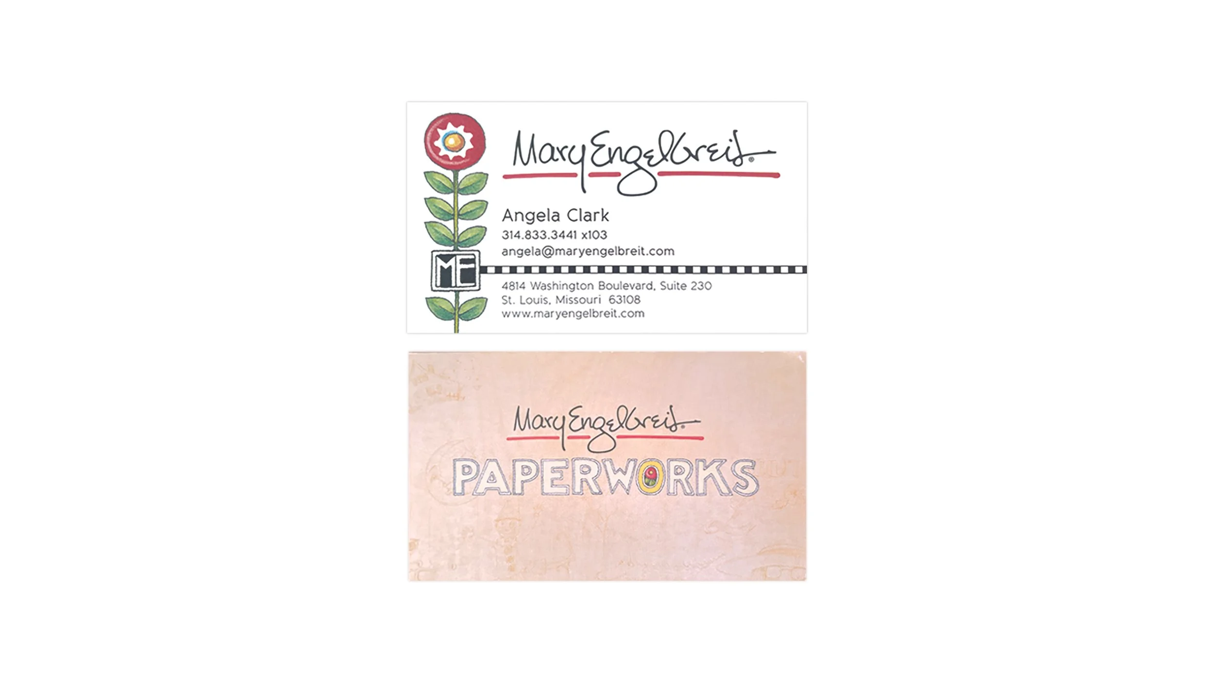

Over the years, new ideas about the direction of Mary Engelbreit Studios meant different visual identities for the brand. The most recent iteration is an attempt simplify Mary’s traditional look with clean lines, while keeping the colors bright and inviting. Since the Engeldark line was growing in popularity, that was added on the back. The next one had a focus on “Paperworks” which was what we called the manufacturing division of the company at the time. In the last example, the company was divided in two, with one part part of the brand devoted to Mary’s traditional look, and the other focused on attracting new customers and licensing prospects in the home decor category.